and harder to read as well
News - CNET
4 Likes
Yes, looks like a bad student design attempt.
At least they avoided arranging the letters into a grid.
For reference, here are the previous versions:
Colloquially - FUGLY…
3 Likes
It’s hard to make out the CN, so all that’s left is the ET, the font of which matches Entertainment Tonight. And hey, why not? Maybe they can copy their cheesy theme music to match what passes for tech journalism these days…
4 Likes
To save people the click:

1 Like
Seeing it in isolation like that reminds me of the title screens from schlocky 80’s horror films
2 Likes
The 70s/80s called.
I think they’re trying to go for a more ‘mature’ look. Something like The Economist or The Atlantic.
That it’s CNET doing this is just… urrrrgghh
1 Like
Oh god, the animated version…

Are we sure some art grad wasn’t having them on?
4 Likes
Eek. They must be kidding, right? The entire site looks just… wrong. At first glance, I thought the site had gotten hacked. Next, what seized my attention is searching for reviews now is a total and complete disaster. There are no tags for reviews, be it scoring, category, or an image. Honestly, it looks like an intern was handed complete creative control of the company’s design team and they rush bought a $5 WordPress fashion blog theme off of Fiverr. If they are trying to increase viewership, they just lost my interest entirely.
While we are on this topic of devolving logos, I am really not a fan of these “grown-up” logo redesigns. Companies just don’t know how to have fun anymore or to be bold. Here are many fine examples of logos gone wrong:
https://logobly.com/blog/logo-redesign-fail/
The drive for flat and simple has caused the pendulum to overswing to straight up soulless and cringey. That includes you, Microsoft, with your four mind-numbing color boxes that any two-year-old could have created in MS Paint. It is like companies are afraid of taking creative risks and expressing their own flavor of emotion in fear of offending someone.
2 Likes
It must be the clever handiwork of a tired and underpaid intern who was binging that and Stranger Things. Horror is the word for it alright…
3 Likes
Come to think of it, maybe they were inspired by the apple news logo with the heavily cropped N. If that’s indeed what that is.
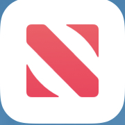
4 Likes
Nice catch!. The artists here I’m already are well aware of this, but I continue to be surprised by how much the legibility or intent can be impacted by something as simple as size.
To use the example Apple News Logo, it very much looks like an N on my phone or iPad, but blown up here and lacking context, it just looks like an arbitrary icon.
2 Likes
The whole thing is typographic malpractice.
6 Likes
Slot machine for click bait.
3 Likes