I would advise caution using even a tiny piece of Apple’s logo given that they are so litigious about it.
3 Likes
Personally like the prior one better, brighter and cleaner to my eyes. This one almost has a Frankenstein meets Apple look to it ![]()
I think the core idea is spot on though in that we aren’t specific to an OS or brand
1 Like
I actually like this better than anything else I’ve seen so far. Stylized imagery that’s not specific to any brand or model, but with a squares pattern reminiscent of the modern Windows logo which kind of harkens back to the origins of tablet PCs. The colors are pleasant, too.
5 Likes
Wonder why I didn’t think of that - why not just use a real red apple (McIntosh)… ![]()
Actually, I vote with Ted for the stylized device logo: +1: ![]()
I think the biggest thing you need to ask is, what image do you want to portray for this site? When I first found the old TPCR site, I was looking for technical feedback and information on tablet pcs. The logo was simple, clean, but looked techy enough and professional enough that I thought I could trust the site with the information provided.
Many of the logos from whitefox are busy, artsy, but mostly put off either an underground coffee shop, or early 20s moody artist vibe. It doesn’t make me think I want to get information on tablets. It’s good art, but is it the branding you want? There are some gems though. I like this one in particular. It’s got what looks like a device with the & sign, and even has a simplified Hedgehog. of course, it’s already been designed, so idk how much he would want to borrow from this design, but it really fits the site IMO.
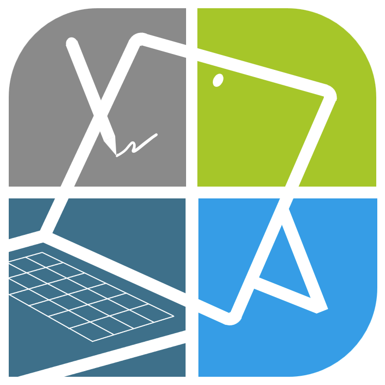
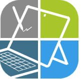
One more and then it’s back to actual work… ![]() Below represents Apple (top left, gray and very rounded to represent their apple logo), Android (top right green and very rounded to represent their logo), Windows (lower right, blue from the windows logo, slightly rounded for the new rounded corners), and TPCR (the old dark teal (?) forum color, straight just because). TPCR letters scrunched in the center so it doesn’t look so much like a children’s alphabet learning tool.
Below represents Apple (top left, gray and very rounded to represent their apple logo), Android (top right green and very rounded to represent their logo), Windows (lower right, blue from the windows logo, slightly rounded for the new rounded corners), and TPCR (the old dark teal (?) forum color, straight just because). TPCR letters scrunched in the center so it doesn’t look so much like a children’s alphabet learning tool.
And if people like this mix of round and square edges, I can separate out the corner elements to get the more ‘windows logo’ feel, remove the letters, and overlay the stylized device sketches from above. It’d remove the blatantly “Microsoft” vibe, and maybe subliminally signal inclusivity.
3 Likes
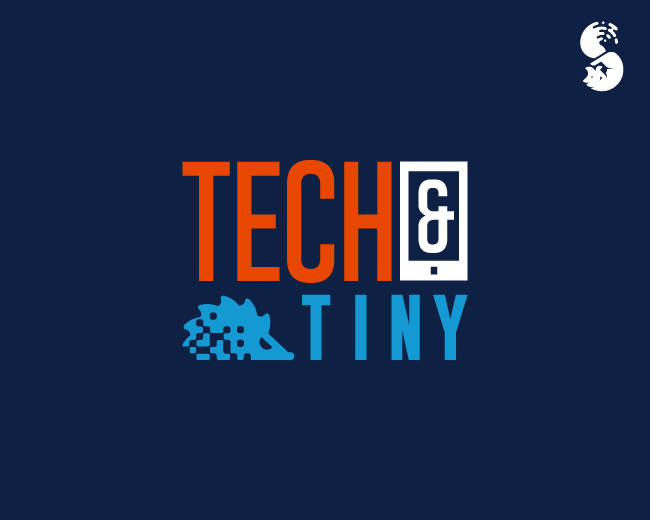
@James - Did you know? Tech & Tiny was this forum’s predecessor as a fallback in case TPCR died. Thus inclusion of the hedgehog for @Hifihedgehog ![]()
2 Likes
Well that’s fun. I did not know that. No wonder it fits!
@Hifihedgehog I think a redesign of that would be pretty cool. TPCR with a tablet and hedgehog?
1 Like
But giving the hedgehog a round eye. The current one looks a little mean. ![]()
1 Like
So with the caveat that my artistic sense is even more suspect than my drawing abilities, I like this one as well. The only slight tweak I’d make is to have all four corners with the more rounded edges like in the top.
This one also as the look to my eye of being more tech oriented though I can’t say exactly why though perhaps it’s reminiscent of Apple’s “Flat Design” language.
That all being said I still slightly prefer the earlier one as it’s a bit more playful to my eyes and thus inviting to newcomers
2 Likes
I can try that mashup of the earlier playful MS themed version and the more muted version tonight, if we can wait that long! ![]()
2 Likes

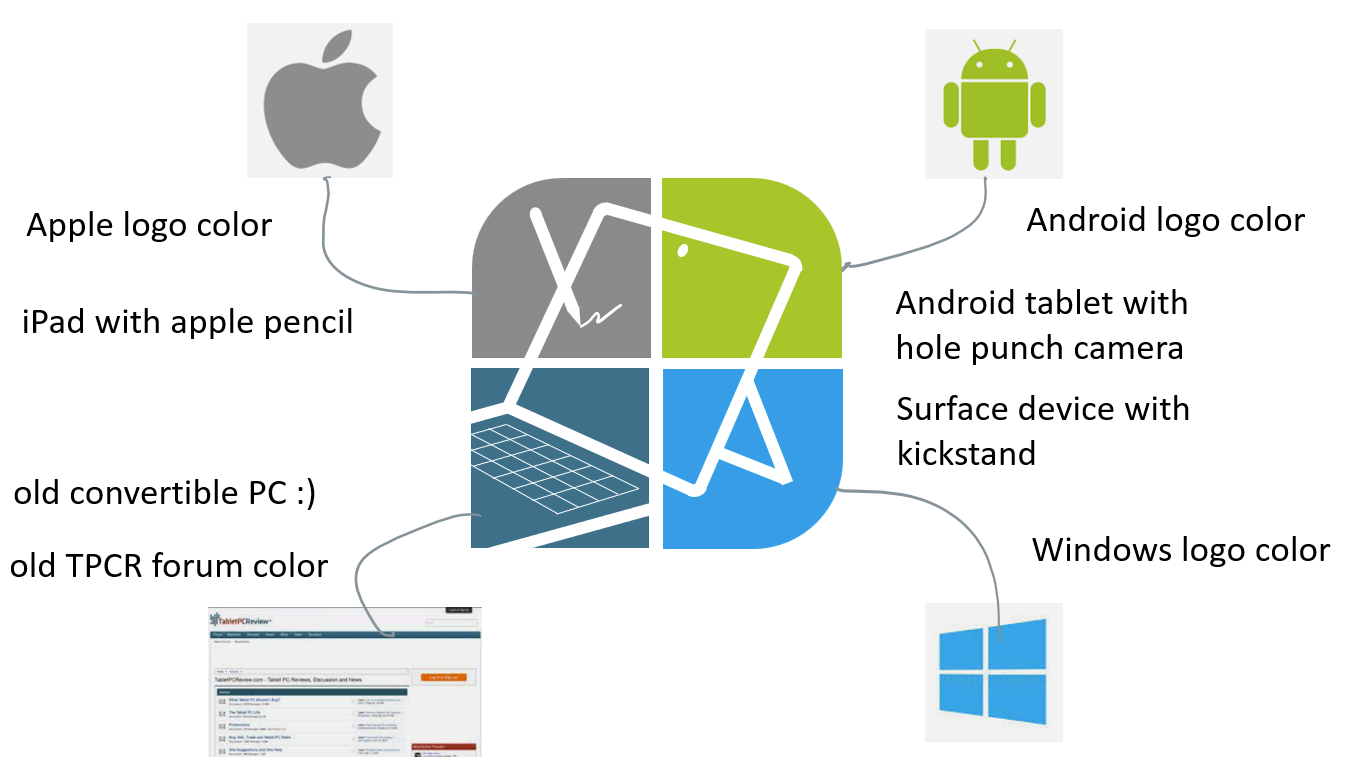
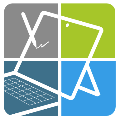
I guess we couldn’t wait that long! ![]() OK, so here’s what I had in mind:
OK, so here’s what I had in mind:

The white dot represents the hole-punch camera found in some Android devices, and maybe the eye of the Android logo, why not. I mean logo’s have to have some story, so I’m sticking with it.
Edit: to clean it up I could make the sketched devices actual straight line drawings, and only keep the “scribble” in the top left hand-drawn. And I’d be fine with making the lower right corner more rounded, so we don’t have to explain that that was not a mistake. ![]() I like the lower left corner square though, if you squint you can imagine that this thing looks like the Discourse speech bubble.
I like the lower left corner square though, if you squint you can imagine that this thing looks like the Discourse speech bubble.
2 Likes
I think I’d still make all the corners rounded or squared - it looks like we just forgot to fix the lower left…in fact, I vote we round the lower left and adopt this logo. ![]()
1 Like
Aw man, I though it looked cool. More interesting than all round and or square. It vaguely has the shape of a speech bubble, and old-style convertible PC’s feel “square”. ![]()
Edit: look, it comes out a little weird with the lower left corner rounded as well:
All rounded
All square works better:
All square

Personally I prefer the ‘more interesting’ partly rounded version. It matches the curvature of the Apple and Android logo’s, which I think is cool…ish. And it’s less reminiscent of “Windows”.
1 Like
OK, OK, I will agree to whatever the majority wants - I just like the overall design and am ready to put it to use!
2 Likes
Maybe a decent compromise: all rounded, but with a tighter curve.
If we like this I can make a fine-tuned version later today (the corners of the ‘tablet’ are not all perfectly attached etc.)
3 Likes