Since we’ve got our snazzy new logo design, I thought it would be cool to have matching colors for our forum topics. I based this off of @Tams ‘swoosh’ rendition of @JoeS’ original design:
With the OS colors matched, ‘Community’ taking the old TPCR teal, and ‘Technology’ set to the swoosh orange. Administrative topics take the existing red color.
(@Hifihedgehog if the designer later tweaks the logo colors, I can update accordingly.)
All-in-all, pretty nice I think. Gives it a more subdued feel and consistency. Should I make the change?
@Marty : Nothing wrong with what you’re proposing but TBH, I like the existing forum colors… Just me, though.
2 Likes
Hifihedgehog
(Hifihedgehog - Waiting for Surface Pro 10!)
4
We had gotten the feedback we needed and will be receiving the logo soon.
1 Like
Hifihedgehog
(Hifihedgehog - Waiting for Surface Pro 10!)
5
That’s great and the swoosh design incorporates points we did discuss, and we will be seeing the design that was selected very soon.
1 Like
Hifihedgehog
(Hifihedgehog - Waiting for Surface Pro 10!)
6
I really like the color matching idea that you proposed and it looks really good. The colors I chose for the forum categories were purely arbitrary and not an effort to make anything match or transition in any particular way. This looks very good!
Yeah, I really like the swoosh because it adds a nice color accent to an otherwise very neutral color palette.
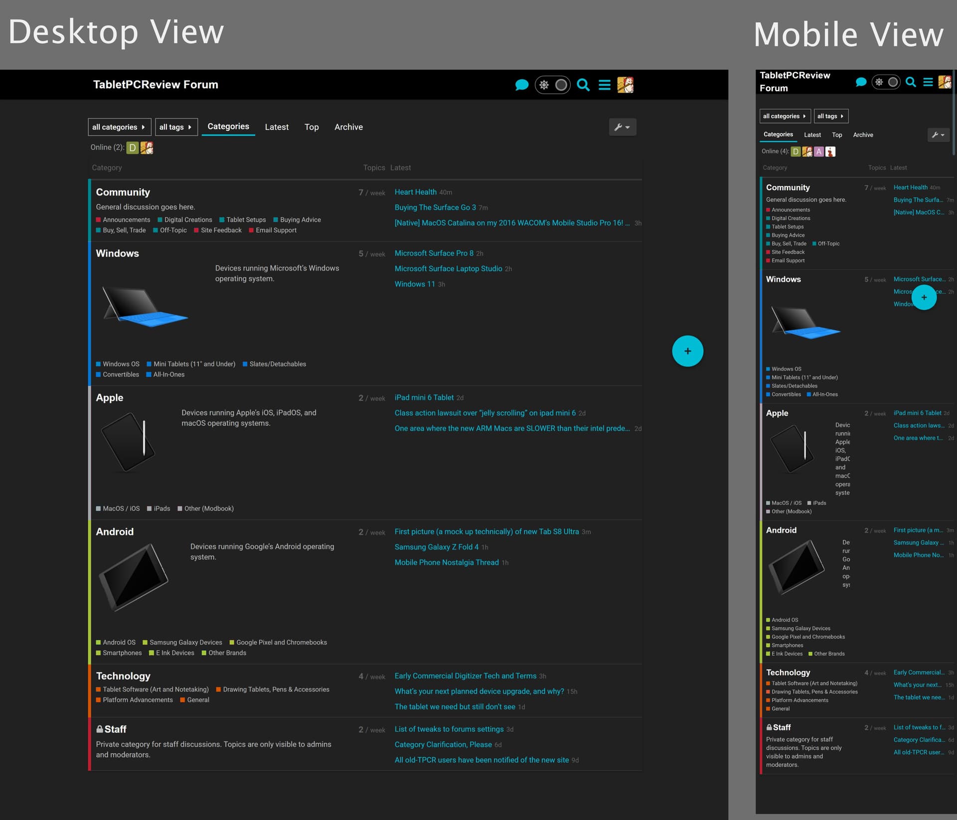
On the subject of color palette @SteveS, maybe I can bring you around to the new colors. I understand that the current colors have more pop, but currently they don’t correspond to the forum topic structure.
For example, the magenta color is shared by the ‘Apple’ category, the ‘Buying Advice’ subcategory, the "Slates/Detachables’ subcategory, and the ‘Google Pixel and Chromebooks’ subcategory. Since these don’t bear any relation, the color coding squares lose meaning when marking forum topics.
With the new color scheme, each thread would be color-coded in its corresponding group, making the site more visually intuitive. What do you think?
@Marty : I’m not invested in either color scheme and if the consensus is to change it, that’s fine with me. My underlying question really was: why does everything have to match? The logo color selections were very thoughtful, but really, we’re probably the only ones who actually care about the what and why of them. Most visitors (and likely many members) will simply visit the forum and go to the threads that interest them. Probably most will not remember what any of the colors are.
I think that you were one of the ones who argued that the forum structure should be simplified. But simplicity can be a tricky thing, sometimes. And consistency can be both logical but also a burden. To quote Einstein , “Everything should be made as simple as possible, but no simpler”. I typically vote for that!